

Visualization by Example, Chenglong Wang et al., ACM on Programming Languages (POPL), 2019
Let’s start with a paper I liked a lot recently! Visualization nowadays becomes a challenging topic when the data shown scales up easily in modern analytics. There are lots of paper working on speeding up the data wrangling process for visualization, but what I like in particular for this paper is that it addresses the needs when users wants to create visualization with only a ‘‘glimpse’’ of the database (e.g. four rows out of 1M rows or two tables out of 1000 tables). The following figure shows the example of the query and result.
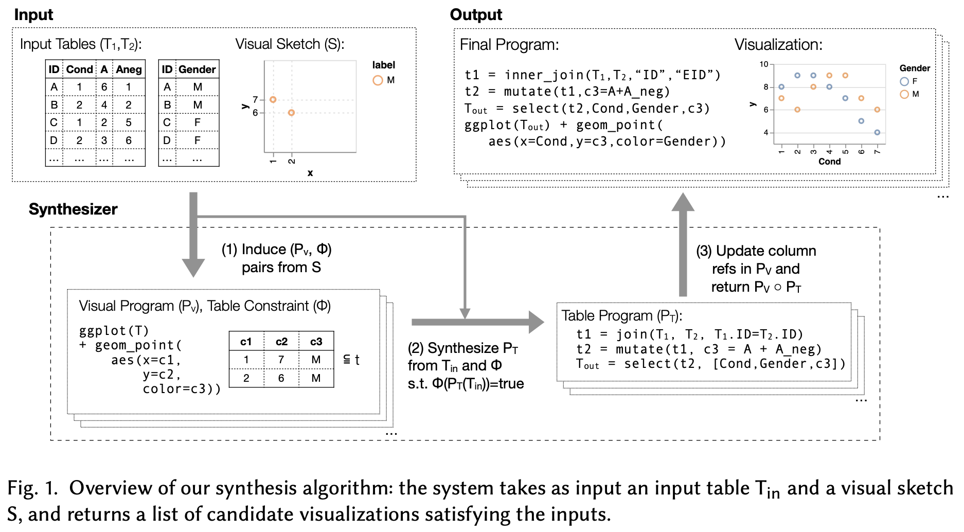
In the example, a user creates a visualization with (1) y-axis corresponding to the sum of two columns (“A” and “Aneg”) from Table 1; (2) x-axis corresponding to the ‘‘Cond’’ column in Table 1, and; (3) color labels corresponding to the “Gender” column in Table 2. Therefore, the algorithm needs to figure out:
- which tables to join in order to match the resulting table from the visual sketches (
join) - which columns to add/subtract/multiply from the joined table to generate the values (
mutate) - which columns to visualize from the resulted (join + mutate) table (
select)
One of the insights is that steps (1) - (3) are ordered, in which we can validate the combinations of possible join outcomes before validating other possible combinations with mutate and select. For example, if we already know that the joined result can never produce any results that look like the one from the visual sketch, we do not need to proceed to try to mutate or select the columns.
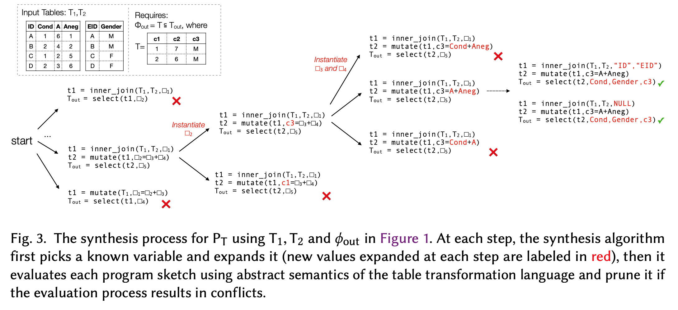
Similarly, we can revert the validation process as well. From the visual sketch, we can perform (3) - (1) to see if it can recover the table structures given a fixed choice of mutate and join. If the resulting table from the visual sketch after performing steps (3) - (2) has conflicts with the table after performing step (1), we can prune the selection.

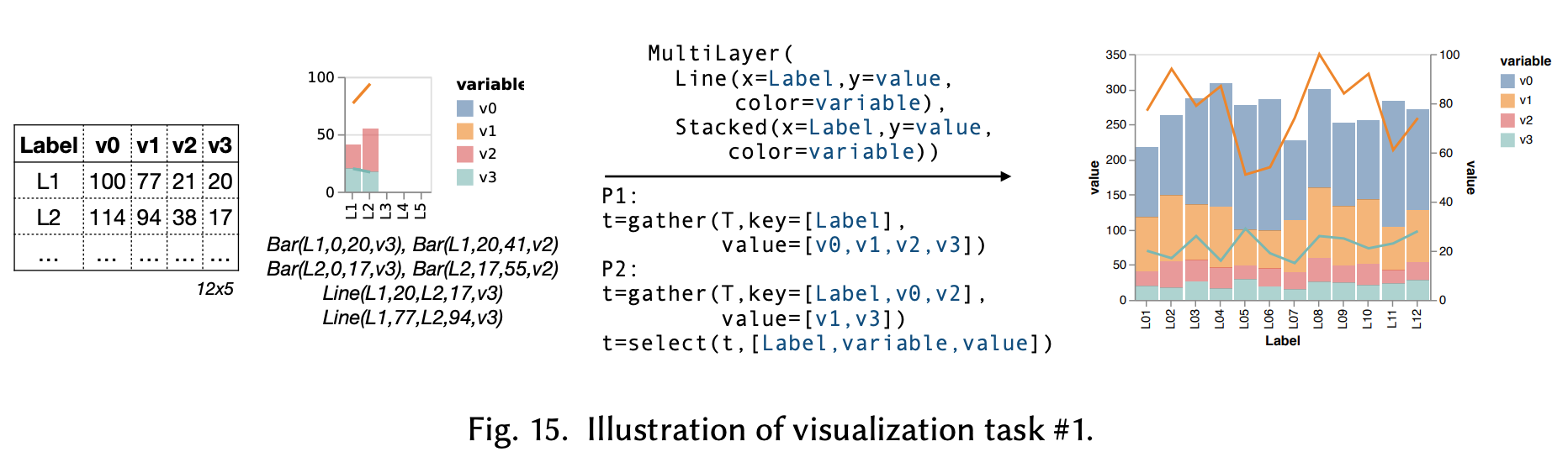
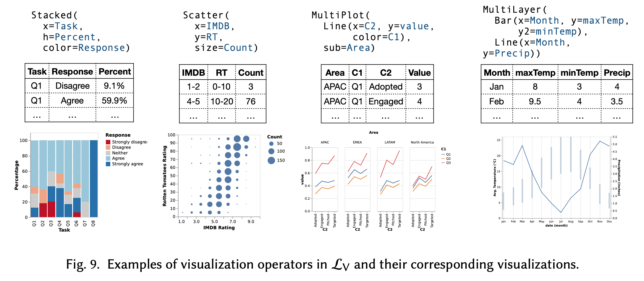
Given the resulting table, we can also create a visualization that looks different from the visual sketches as well. The work uses Vega-Lite as the specifications for visualization. Below are some examples:
The analysis between the possible visualizations and a table, both from the visual sketches and tables during the pruning stages, enable certain degrees of coverage in synthesizing the data wrangling steps. The intuition is that if a visual sketch can be “decomposed” into a line chart or bar chart, while the tables being validated can also be decomposed as a line chart, then a match will be resulted. The work has a detailed discussion into the rules for such purposes, but I am not going to discuss them here.
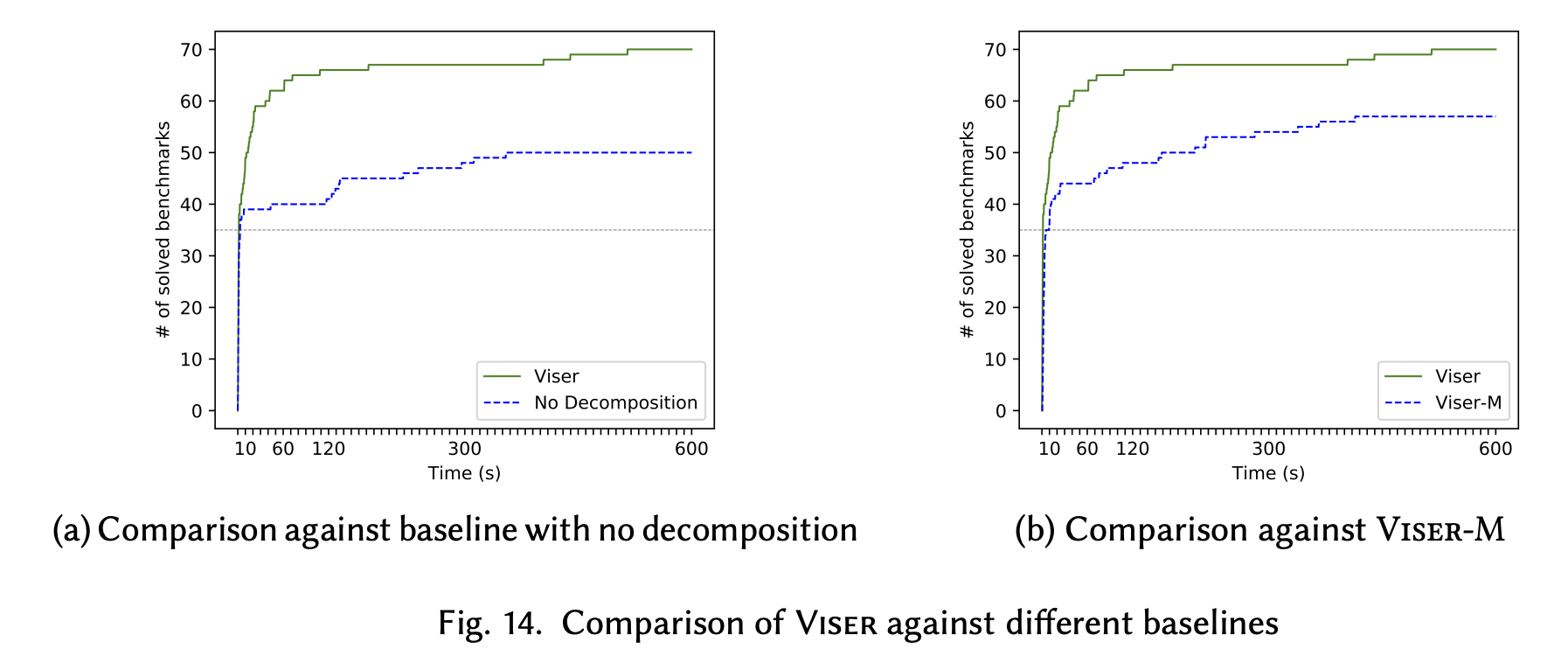
For evaluation, the work presents the recall of ground truth visualization among the algorithms with/without the visual decomposition and between itself and a benchmark called Morpheus.
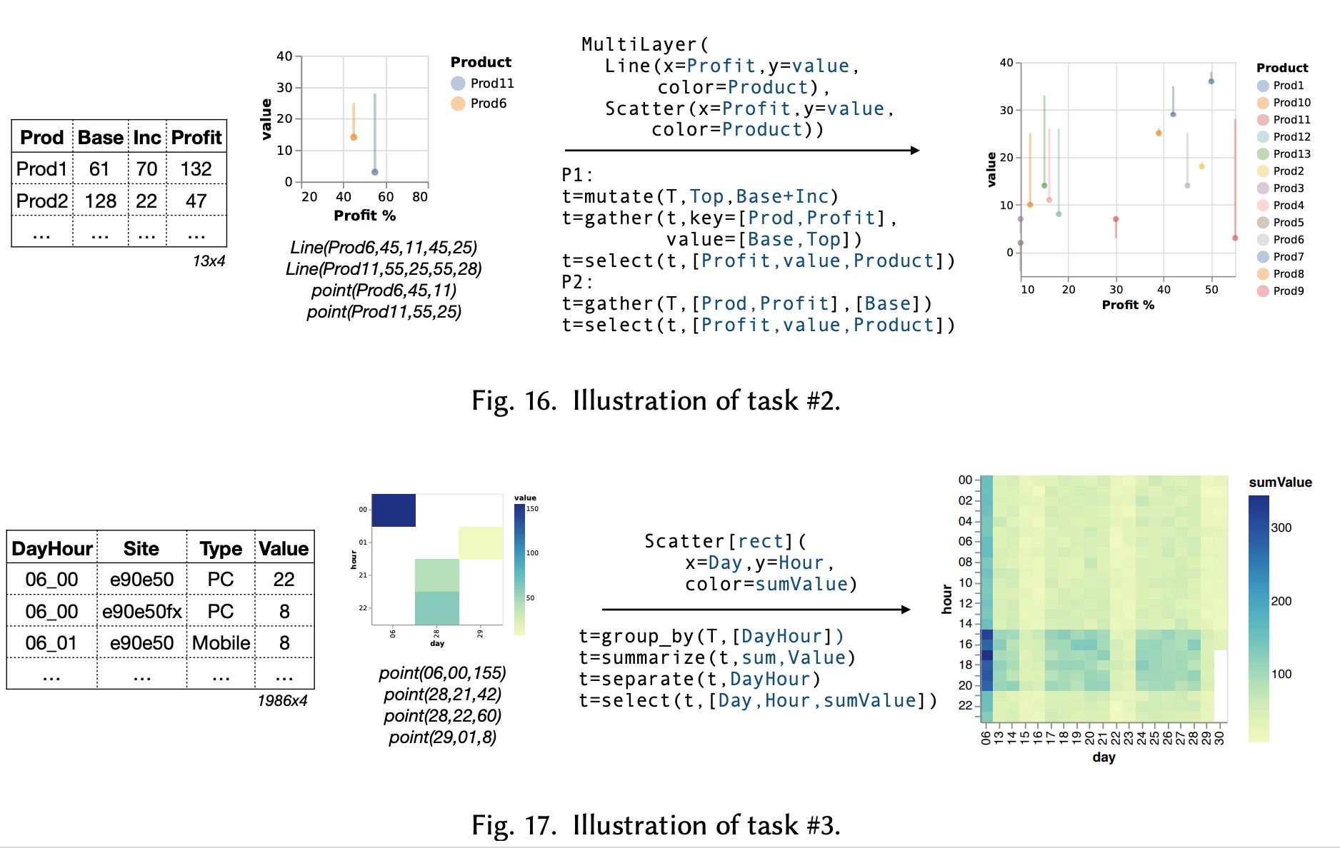
Here are some examples of visualizations created as well.